About This Project
The Visual Accessibility Simulation project is an educational platform designed to help interior design students understand how individuals with various vision conditions experience built environments. Through evidence-based vision simulation, the goal is to help students develop empathy and practical skills for creating inclusive designs.
Research-Based
Built on peer-reviewed vision science research, including models from Thompson et al. (2017) and Pelli & Bex (2013), ensuring clinically accurate simulations of vision conditions.
Educational Focus
Designed specifically for design education, promoting reflection-in-action and empathy-driven design thinking beyond minimum accessibility standards.
Multiple Conditions
Simulates reduced visual acuity, contrast sensitivity loss, cataracts, glaucoma, diabetic retinopathy, and age-related macular degeneration.
Experience Vision Conditions Yourself
Drag the slider to see how different vision conditions affect perception of the same space. These interactive demonstrations help you understand what people with various vision impairments experience.
👆 Click and drag the slider left or right • 📱 On mobile: touch and drag
Reduced Visual Acuity
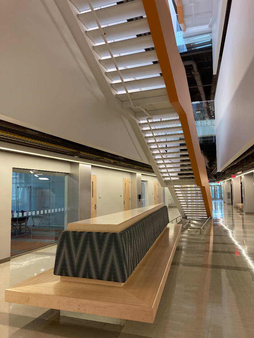
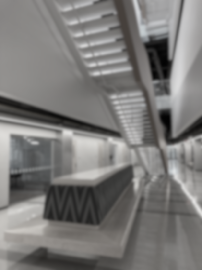
20/20 → 20/200Visual acuity measures the clarity or the sharpness of vision. 20/20 vision means one can clearly see at 20 feet "what should normally be seen at that distance". A person with 20/200 vision must be at 20 feet to see what someone with 20/20 vision can see at 200 feet.
Perceptual shifts
- Fine detail softens or disappears (small text, thin lines, distant objects).
- Edges look less crisp, so objects can blend into their background.
- Recognition slows: you may see something but can’t quickly identify it.
Environmental challenges
- Reading signage at typical distances becomes difficult (room numbers, directories, exits).
- Level changes and step edges are harder to detect—especially with patterned flooring.
- Small controls are easier to miss (keypads, switches, card readers, elevator buttons).
Design strategies
- Use larger type, strong hierarchy, and simplified signage layouts.
- Make hazard edges legible: clear nosings, contrasting strips, reduced clutter at transitions.
- Prioritize bold, clean boundaries (avoid thin lines and subtle material changes at critical edges).
Contrast Sensitivity Loss
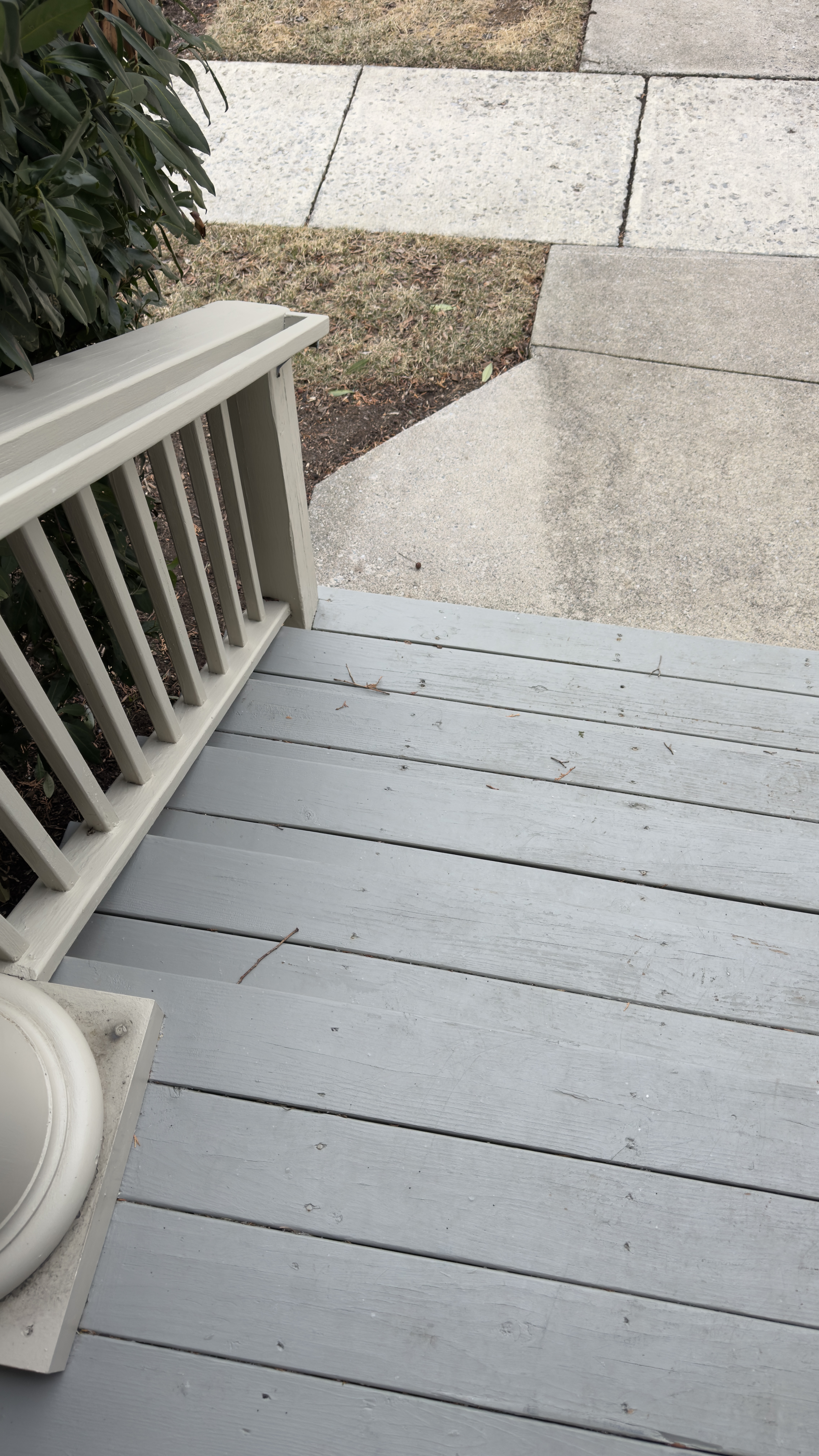
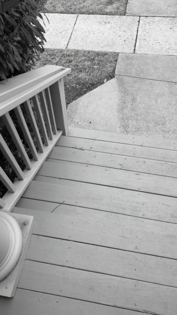
Normal → Moderate LossContrast sensitivity is the ability to distinguish between an object and its background. Someone with reduced contrast sensitivity can struggle to see subtle differences in edges and fine detail, making stairs, curbs, and level changes particularly dangerous.
Perceptual shifts
- Differences between surfaces become harder to notice, even when objects are technically visible.
- Midtones compress, making spaces feel flatter and edges less obvious.
- Glare and backlighting can further reduce what you can detect.
Environmental challenges
- Low-contrast hazards may disappear (single steps, subtle slopes, glass edges).
- Wayfinding slows because landmarks and decision points don’t “pop.”
- Low-contrast or glossy signage becomes unreliable under real lighting.
Design strategies
- Design with luminance/value contrast in mind—not color alone.
- Separate planes (floor/wall/door) with clear value differences or lighting emphasis.
- Control glare and avoid high-reflectance finishes at critical information zones.
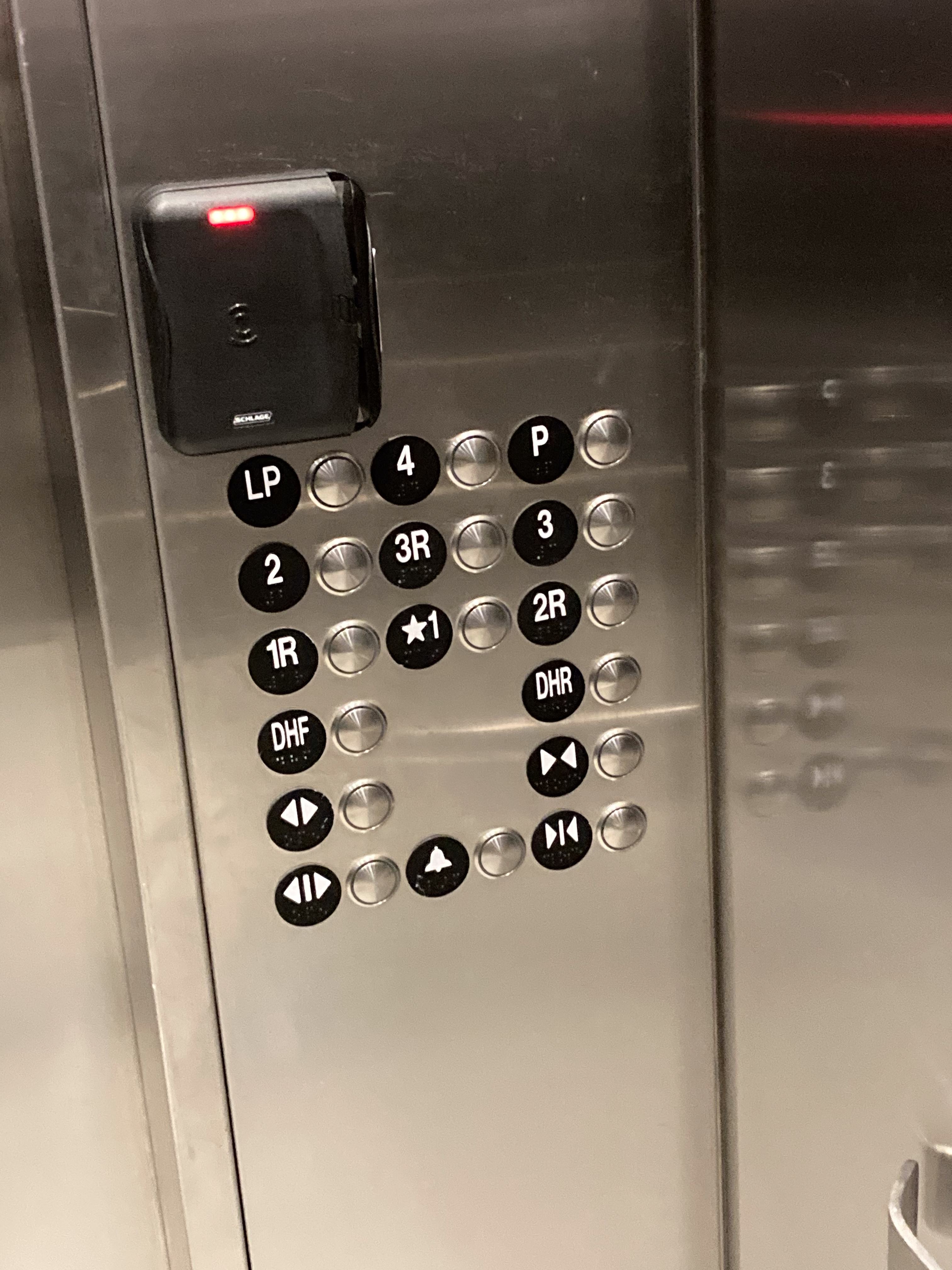
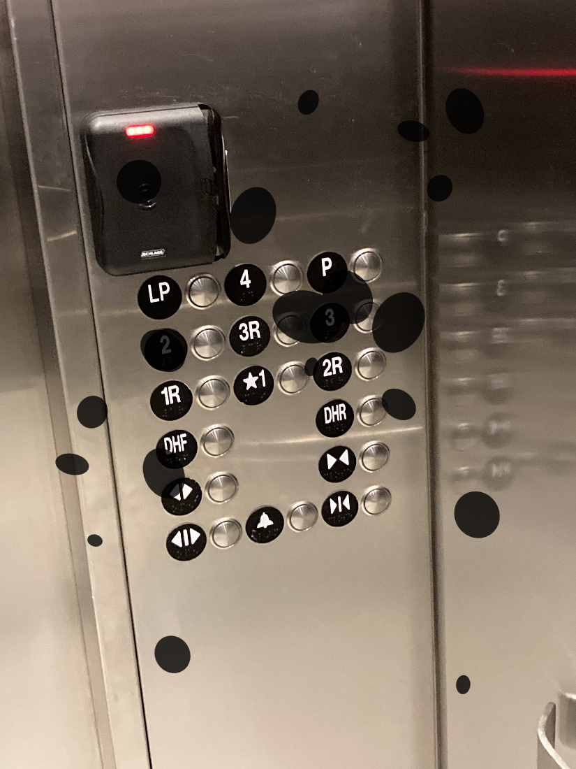
Diabetic Retinopathy
Moderate StageDiabetic retinopathy is caused by damage to the blood vessels in the retina. Vision symptoms can include blurry vision and floating spots.
Perceptual shifts
- Patchy areas of blur or missing detail can fluctuate over time.
- Fine patterns and text may “break,” making reading frustrating.
- Visual confidence drops because clarity is inconsistent moment to moment.
Environmental challenges
- Small, detailed interfaces become difficult (elevator panels, keypads, thermostats).
- Trip hazards may be missed if an occlusion overlaps the edge at the wrong time.
- Busy flooring patterns can become confusing instead of helpful.
Design strategies
- Make interactive elements larger, higher contrast, and consistently placed.
- Use redundancy: tactile cues, audible confirmation, simple icon + text systems.
- Avoid busy patterns near hazards and decision points; keep transitions visually clean.
Color Vision Deficiency
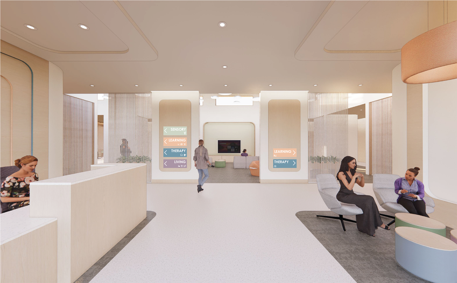
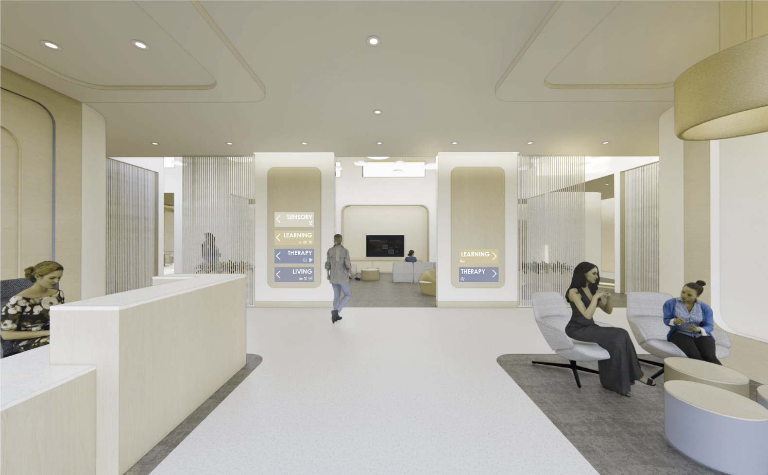
ProtanopiaProtanopia is a type of red-green color vision deficiency. People with protanopia have difficulty distinguishing between reds and greens because the red-sensitive cones in their eyes are absent.
Perceptual shifts
- Certain hues are harder to distinguish (most commonly red–green differences).
- Color-coded information can collapse if values/luminance are similar.
- Surfaces that feel different by color may look similar in practice.
Environmental challenges
- Wayfinding that relies on color alone (zones, lines, maps) may fail.
- Red/green indicators (occupied/vacant, status lights) can be misread.
- Safety cues may be missed if meaning is encoded only through color.
Design strategies
- Never rely on color alone: add text, icons, patterns, and consistent placement.
- Check contrast by value/luminance—not only hue.
- Use multiple channels for meaning: shape + label + location + lighting emphasis.
More Conditions Available
The full simulation tool also includes demonstrations of:
-
Glaucoma:
Glaucoma is a group of eye conditions that damage the optic nerve, often associated with increased intraocular pressure. It typically causes progressive peripheral vision loss, while central vision may remain clear in early stages.
Perceptual shifts:- Peripheral vision narrows; information from the sides is detected late.
- Navigation can feel uncertain; users rely more on central cues.
- Obstacles may appear “suddenly,” increasing stress in motion.
- Higher collision risk with protruding objects (open doors, wall-mounted features, furniture corners).
- Busy corridors are difficult; people approaching from the side may be missed.
- Stairs and level changes may be missed unless directly fixated.
- Keep circulation paths clear and predictable; reduce clutter and unexpected protrusions.
- Strengthen path definition: continuous handrails, clear edge cues, consistent landmarks.
- Use lighting and contrast to emphasize “where to go” and “where not to go.”
-
Age-related Macular Degeneration (AMD):
AMD affects the macula — the central part of the retina responsible for sharp, detailed vision. It primarily causes loss of central vision, while peripheral vision remains intact.
Perceptual shifts:- Central vision is reduced or missing; peripheral vision may remain.
- Reading and face recognition become difficult.
- Users may look slightly off-center to use healthier retina.
- Reading directories and room signage is challenging even with good lighting.
- Recognizing destinations (service desk, entry door) takes longer.
- Precision hazards (stairs, small level changes) are riskier when the point of focus is impaired.
- Use large, high-contrast signage with strong icons and consistent placement.
- Create bold landmarks (silhouettes, framed features, lighting “beacons”).
- Make hazard edges legible even in peripheral view (clear nosings, continuous handrails).
Why Visual Accessibility Matters
Approximately 12 million Americans aged 40 and older have vision impairment, including 1 million who are blind, 3 million who have vision impairment after correction, and 8 million who have vision impairment due to uncorrected refractive error (Centers for Disease Control, 2024 update). As designers, we have a responsibility to create spaces that work for everyone.
12M+
Americans with vision impairment
93M
Adults at high risk for vision loss
1 in 4
Adults over 65 with vision impairment
Visual accessibility goes beyond meeting minimum code requirements. It's about understanding how design decisions affect the daily experiences of people with varying visual capabilities. By simulating these conditions, you can make more informed, empathetic design choices.
How to Use the Simulation Tool
Follow this workflow to simulate vision conditions on your design images or existing built environments using photograps. The process has three phases: preparation, using the tool, and reflecting on your findings.
Before: Prepare
Get ready for accurate simulation
Proper preparation ensures your simulation results are meaningful and accurate:
- Capture your design — Use a photograph of an existing space or your digital rendering. JPEG, PNG, and HEIC formats all work.
- Note your camera/lens — For photographs, the tool can auto-detect camera info from EXIF data. For renderings, know your virtual camera's horizontal field of view (FOV).
- Consider sightlines and usage scenarios — Think about where people will stand and what they need to see (such as paths, signage, stairs, doorways).
- Include daylighting scenarios — Compare across different hours and seasons, especially for spaces near windows or skylights.
- Multiple angles help — Capture the space from different viewpoints to understand the full user experience.
In the Tool: 4 Steps
These steps match what you'll see in the simulation tool
Upload or Sample
Upload your design photo or rendering, or use a sample scene to explore the tool's capabilities.
💡 High resolution images and large sized files will be scaled down after upload and may take longer to process.
Check Field of View
Verify the camera's field of view is correct. The tool auto-detects from EXIF, or you can set it manually.
💡 FOV affects blur computation accuracy — Render plugin default is ≈ 90°
Simulate Vision
Adjust acuity, contrast, and enable conditions like cataracts, CVD, glaucoma, DR, or AMD.
💡 You can enable more than one condition at a time or click reset to start from scratch.
Download Images
Download the simulated image or a side-by-side comparison. Simulated settings are included in the footer.
💡 Use comparisons for design iterations
After: Reflect and Improve
Turn observations into design improvements
The simulation is just the beginning. Critical reflection transforms observations into better design:
👁️ Observe
- What elements became invisible or unclear?
- Are wayfinding cues still visible?
- Can users detect level changes and hazards?
- Is color-coded information still distinguishable?
📝 Document
- Save side-by-side comparisons for your portfolio
- Note specific problem areas and why
- Record which conditions revealed issues
- Report critical findings
💬 Discuss
- Share findings with classmates and instructors
- Consider different perspectives and experiences
- Debate design trade-offs
- Learn from others' observations
🔄 Improve
- Revise your design based on findings
- Re-test with the simulation tool
- Iterate to improve accessibility
- Document before/after comparisons
The Empathetic Design Cycle
Prepare → Load → Verify → Simulate → Export → Observe → Document → Discuss → Improve → Repeat
Tips for Effective Use
- Test multiple viewing angles and distances
- Consider different lighting conditions (day/night, natural/artificial)
- Don't just check for code compliance—think about user experience
- Discuss your findings with classmates to gain different perspectives
- Remember that these are simulations; real users may experience conditions differently
Additional Resources
Learn more about vision health, accessibility standards, and inclusive design. This section will be updated regularly with new resources.
Vision Health Organizations
Accessibility Standards and Guidelines
Research Papers
Additional research papers and validation studies coming soon.